

On the Eighth Day Of Christmas Lifetime gives to you:
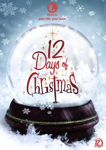
12 Days Of Christmas Movie Collection. You get 12 Lifetime Holiday movies on DVD. That’s nearly 18 hours of Holiday Magic. Keep the holidays with you always. We have two copies so that means two lucky winners will get this collection. Movies include: The Road To Christmas, Under The Mistletoe, Christmas In Paradise, Holiday Switch, Home By Christmas and 7 more movies. That’s 1 movie for each of the 12 Days Of Christmas all in one box.
- Fill out your name and email address in the comment form below – your email address will remain private and visible only to us.
- Do not post your address as an actual comment! Instead tell us- What kind of changes would you like to see here at Upcomingdiscs in 2013.
- Only those comments that answer our question will be considered.
Contest is now closed Winners are Julie Nichols & Nelson Peters
Winners are notified by E-mail. If you did not get a confirmation E-mail from us, check your Spam filter and contact us. Any prize not claimed in 2 weeks will be forfeit and be placed in the end of year contests next Holiday Season.
01/02/2013 @ 3:06 pm
I think the web design needs a little work.
01/02/2013 @ 4:30 pm
Make it easier to navigate around.
01/02/2013 @ 6:38 pm
web page looks too busy. too much info on the side bar
01/02/2013 @ 7:41 pm
Bigger better contests
01/02/2013 @ 8:40 pm
Make it easier to navigate around
01/02/2013 @ 9:02 pm
good contest
01/02/2013 @ 11:00 pm
I think the layout of the site could be improved, maybe making it full screen
01/02/2013 @ 11:32 pm
Improved navigation
01/03/2013 @ 12:11 am
The site feels a little archiac – a make over would have a refreshed feel!
01/03/2013 @ 6:24 am
Love the site & maybe the right sidebar(s) could be minimized a little bit to allow for a wider navigational region for the main content to the left & center. Thanks.
01/03/2013 @ 6:49 am
Make the web page less crowded
01/03/2013 @ 7:29 am
Add some more color to the background of the website. Spice it up.
01/03/2013 @ 7:45 am
Improved navigation and layout!!
01/03/2013 @ 2:48 pm
How about adding some jokes and puzzles?
01/04/2013 @ 12:30 am
The layout! I find it pretty easy to navigate but I guess it wouldn’t hurt tweaking that either.
01/04/2013 @ 9:17 am
I think the site is pretty well designed at this time. Perhaps the sidebar could be smaller but this hasn’t been a big problem for me.
01/04/2013 @ 2:29 pm
maybe just update the look of the site a bit, but other than that I find it great
01/04/2013 @ 8:15 pm
layout, under the browse area on the right it’s only 1/2 used and it limits all posts to 1/2 the page all the way down to the bottom
01/04/2013 @ 10:48 pm
It would be nice if you could make the site more user-friendly and aesthetically pleasing…. 🙂
01/04/2013 @ 10:50 pm
The side bar takes up a good amount of the page, so if you could reduce that, the page would look better. Also, the website design seems a little behind the times, so some updating would help.
01/06/2013 @ 12:04 am
the background color, I would get rid of the grey
01/06/2013 @ 12:06 pm
I would like to see a better Home Page something to get my attention about the whole site.
01/06/2013 @ 10:05 pm
A dwarf reviewer
01/07/2013 @ 10:47 am
I would change the colour !!!!
01/08/2013 @ 7:10 am
maybe update some graphics
01/08/2013 @ 1:30 pm
I would change the colour
01/08/2013 @ 1:31 pm
Make the web page less crowded
01/09/2013 @ 1:19 pm
Try to put fewer items on a page. Sometimes there is so much on a page I become confused about where to find a review quickly.
01/11/2013 @ 12:03 pm
The info is great. Perhaps some site changes to made info more visually appealing.
01/11/2013 @ 11:40 pm
Streamline webpage…and more contests wouldn’t hurt either.
01/12/2013 @ 4:07 pm
I am not a fan of constant website format changes … therfore I would vote for more content … more reviews would be better than simply moving everything around to confuse everyone.
01/13/2013 @ 2:24 pm
Streamline the website to make it less cluttered, but otherwise I like it.
01/13/2013 @ 10:58 pm
There’s a lot going on – maybe make it more visually simple.
01/14/2013 @ 7:43 am
Like it as it is.
01/17/2013 @ 2:52 pm
a little too much going on any one page
01/17/2013 @ 8:41 pm
A wee bit more color!
01/18/2013 @ 2:50 am
Many of the previous comments are good…you know what you have to do now.
01/19/2013 @ 8:28 am
I really can’t come up with anything I’d like to see changed. I don’t find anything particularly wrong with the site design.
Good contest. I was kicking myself for missing this set when it was on Amazon for $12 or so. Of course, I didn’t stumble upon its existence until after it was raised. We are suckers for Christmas movies.
01/19/2013 @ 10:06 pm
less busy
01/20/2013 @ 4:49 pm
More giveaways in 2013
01/21/2013 @ 7:33 am
Perfect as is!
01/23/2013 @ 12:03 am
Maybe brighter colors
01/23/2013 @ 10:08 am
brighter colours
01/23/2013 @ 3:23 pm
brighter colours for sure, a little drab here
01/26/2013 @ 12:50 pm
Looks kinda dull…but I don”t want to be negative….I dont have a web site…
01/26/2013 @ 2:55 pm
More contests and a more organized/easy to follow website.
01/26/2013 @ 3:29 pm
less sidebar
01/26/2013 @ 3:30 pm
no changes, like it the way it is
01/26/2013 @ 9:26 pm
Brighter colour, less clutter
01/27/2013 @ 8:58 am
more contests