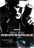
Style over substance. Why is it so rare that we find quality in both at the same time? I suppose I might be showing my own age here, but Renaissance is an extremely hard film to watch. The high keyed image offers no middle tones at all. The result is a stark black and white that offers a strain on my eyes. I understand the idea was to recreate the experience of reading a graphic novel (that’s comic book to my generation). Still, I wasn’t reading a comic, was I? It took the French film crew 7 years to create this film. I wouldn’t have minded waiting longer. The concept isn’t even an original one at all. Sin City and the more recent 300 both utilized a graphic novel style. In those films there was a balance between the style and being careful to allow for a cinematic experience as well. Both of those films carried it off perfectly. Not so with Renaissance. There were no compromises made to make the film work as a film.
The story is also quite convoluted. This was a mistake, particularly when the images themselves would be such a distraction. The tale actually feels like a science fictional James Bond. That idea is further enhanced by casting the voice of Daniel Craig in the lead. The character of Karas even looks, likely intentionally, like an early Sean Connery. It seems that a kidnapped geneticist holds the key to immortality. Officer Karas becomes obsessed with finding her with little apparent support from his superiors. In the end he must make a rather difficult moral decision. Throughout the film we are treated to bizarre characters that often have little to do with the plot. Again, it’s style supplanting substance. Too much “see what we can do” with very little good ever getting done. I will admit that some of the locations are drawn brilliantly and often work better than the live action later animated work.
Video
Renaissance is presented in a 2.35:1 aspect ratio. There is no question that the print is striking in almost every respect. Contrast is a razor’s edge. Either it’s deep black or it’s blinding white. The print is flawless. Black levels are superb. The film would be an absolute failure without it. The rare splashes of color we do get are simply magnificent. I wanted so much more.
Audio
The Dolby Digital 5.1 track is one of the best I’ve heard. It’s unfortunate that the film itself disappoints so, because it has achieved a spectacular position in its technical accomplishments. Surrounds are used to perfection. Rain sequences are particularly fine for subtle ambient effect. I was impressed with the movement of dialogue to realistic locations. At times the speech comes strictly from the rears in what I honestly thought was some of the most clever use of surrounds to date. The aggressive score is reproduced with the same clarity and dynamic response as is the entire film. Such a beautiful video and sound presentation for a poor film.
Special Features
There is only a short feature in French with English subtitles.
Final Thoughts
If this had been a video game it would have been awesome. And that’s exactly what it felt like the entire overlong 105 minutes of this film. This would have made a kick ass video game. As a movie, it lacks too much to make it appealing to any but the most offbeat audiences. The strain of my eyes almost put me to sleep on several occasions. It’s like this monotone voice reached out from the screen saying, “Stay still for the duration of the procedure.”


